Overview
Reviews
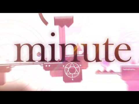
Fun level from Smoop. I really like the sleekness, polish; everything here looks very pretty. I also really like the color change from pink/yellow combos to something bluer and more monochrome, almost like the level is telling you things are "running out of time". Lots of very neatly done motion graphics as well, I can only wish to pull off some of these effects and transitions myself.
There's some tiny gripes I have with this level. I wish the level was exactly a minute to really drive in its message, although I know that would require changing a bunch of stuff. I'm not too big of a fan of some of the designs like the city part at around 30% where I feel like it could benefit from some better use of depth. I would also like to see a bit more thematic focus to really hit on the messages of what a "minute" represents. Perhaps this could be tied to the gameplay as well, which mostly seems like something along for the ride rather than an integral component.
Info
Videos

Replays
SubmitGDPR Cookie Consent
Hyperbolus uses cookies and local browser storage to enable basic functionality of the site. If we make any changes to these options we will ask for your consent again.
sorry about this gang
