
Overview
Reviews

Surprised no one here knows what this level is referencing. I guess that makes me a fool to remember Call of Duty Zombies
I am a COD BO3 hater but this level honestly does the best with translating it into GD. It's certainly much much worse than the original Revelations (which I am already not a fan of, it's incredibly gaudy), but this is something that younger me would love a lot and I think that Revelations lends itself to making for a better GD level since there's a lot of stuff to draw from (even though very little of it is original) compared to maps that I think are much better, like COTD, MOTD, Buried, what have you. It's still really fucking ugly- I find it hilarious the level of detail that is reduced translating it into GD, almost as bad as the Xbox360 version of the game.
It surprises me that a level like this was published in 2025- you would think this would be an early 2.1 level with the fact that it's been 10 years since COD BO3 came out. Revelations was released in 2016, so having a tribute to it all those years later really says a lot about BO3's surprisingly strong staying power compared to the series' more recent titles, which have been forgettable trash.

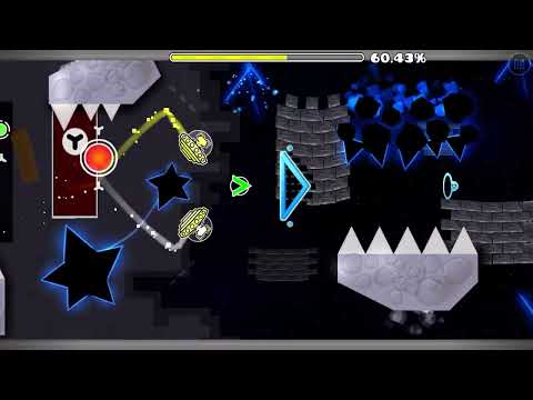
There's a lot of unbridled "early 2.1 art level" energy going on in Revelations, and in that aspect it's quite solid. The art quality is rough at times, with many of the assets having small visual errors, inconsistent outlines or otherwise very obvious usage of certain default blocks for texturing (namely the bricks near the beginning), but personally this is something I enjoy and find quite nostalgic. I like when levels take creative liberties to recreate real life without leaning on blending, alpha or other similar mechanics to create smoother, cleaner art as is more common nowadays.
I couldn't tell you much about this level's overall theming, which is a big point of criticism I have. When your level is so art-centric as to necessitate nearly every aspect of it being geared around a singular aesthetic or inspirational setting, as Revelations' individual parts are, I think a pretty strong overarching theme or stylistic correlation is required to create a cohesive final product. More traditional styles like design generally do this by way of specific habits creators will fall into with their works, like structuring shape, usage of specific blocks or textures for details (think Namtar's late 2.0-early 2.1 works), or even how they use negative space to highlight their designs like someone like Chase97 would with his comparatively simpler backgrounds and very complex, angular block designs. This is extremely hard to pull off in an art level without a cohesive theme, and in the case of Revelations each part's ideas are pretty much completely different (a castle placed next to what seems to be the inside of a creature's stomach chronologically, with no real transition between them), leaving little part-to-part connection. (edited)
With that said, I will commend xGDFUNx for integrating intuitive structuring into their art. Every part's hazards are set up in such a way that their nature is quite obvious to the player, which is relatively uncommon in these kinds of full art levels. My favourite example of this is the long, waving neon green tendrils towards the end, s they mesh very nicely with the acidic theming while also standing out as being hazards in both colour and shape. This makes the level quite enjoyable to play, so despite the aforementioned flaws I would personally recommend it for Feature. There's tons of potential for this creator to further explore art-based levels, and I look forward to seeing more of them in the future.

What

No idea what led to this levels creation but im glad that it exists cause its hilarious. Bonus points for the fake swastika designs just an absolute favorite

Info
Videos
Replays
SubmitGDPR Cookie Consent
Hyperbolus uses cookies and local browser storage to enable basic functionality of the site. If we make any changes to these options we will ask for your consent again.
sorry about this gang