
Overview
Reviews


visually beautiful level, but like always, there are some problems that prevent it from being my favorite.
the first 5% is the hardest and it sucks, the black orb clicks at 3% are RNG.
at 10%, there are portal designs moved above the level covering the deco. it is obviously a mistake, and i don't understand why they did that, this part looks lackluster without them, and thus all the portals here are invisible.
the level feels unbalanced. 13-16% is free, and you can also fall out of the level there at 15% until 28%, leading you to the calm mini cube part, but then you lose the clicksync for the rest of the level.
also you can skip a ton of orbs in that part, and there is an inconsistency throughout the level with orbs sometimes requiring you to click them because of saws, and other times they don't despite being obviously skippable.
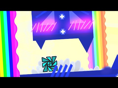
at 16%, all the non-spike hitboxes cease to exist, letting you escape the level temporarily.
after the mini cube part, there is an easy and satisfying clicksync part decorated by smoop. unfortunately, after his deco ends, the level goes back to being bad again. the following clicksync gameplay is more rough, and just for the sake of clicksync, you have to do 3 clicks really fast twice in this part, coming off as surprisingly high cps, no other part in this level requires you to suddenly click so quickly.
at 75%, there is ugly glow all over the background, visually ruining this part of the level. LDM doesn't change anything.
at the monotonous clicking part at 85%, this part is visually pretty much perfect. but the gameplay near the end of it doesn't work very consistently/comfortably.
the next part after that with the same kind of gameplay has a pixel style deco, which kind of sticks out in my opinion, also it seems the creator's icon/logo is copy pasted repeatedly throughout this part, and it doesn't toggle off when the rest of the part does once you leave it. the gameplay here works fine though.
the last ship part looks alright but it feels a little wrong and not very satisfying in my opinion.
the whole layout was evidently made by one person, as you can see copypasted things such as the same mini ship red orbs downwards corridor like 3 times in the level, and the obsession with 2.1 F blocks. it's okay to make all the gameplay, but it should be fresh throughout and not reused ideas.
there are some parts that i actually prefer on LDM than on full detail.
for example, the fast flow part at 6% has all these 3 stupid screen effects no one asked for, like the white scaling squares on the sides bothering your view, the other colored scaling squares in the background, and then the rotating checkered bg behind all that. LDM only keeps the last one, which i prefer, actually the 2nd to last one is rather fine too, but i hate such fake scaling effects that end up looking laggy/ugly in 2.2.
the slow blue rainbow part is really nice and chill, but on full detail, the "leaves" foreground that just look like ugly blurry rotating paint splotches ruins it, even on UHD quality they still look like that. LDM removes them, but then it also removes other nice things in this part.
the LDM also isn't effective enough sometimes. it seems that it was made by the decorators, so some parts don't even seem to have any LDM at all, others are weak, etc, some parts are still laggier than others for me.
all these issues make me have to bring my rating down a lot. i wish this level was better.


Structuring feels way too forced and is the stark visual detractor from this otherwise just okay level
Info
Videos
Replays
Submit

GDPR Cookie Consent
Hyperbolus uses cookies and local browser storage to enable basic functionality of the site. If we make any changes to these options we will ask for your consent again.
sorry about this gang