Overview
Reviews
Alright, Ive been wanting to review this level for weeks because I think it would be interesting to talk about the flaws this level has and how much of a negative reputation this level has on this website, having just over a 2/10 overall. Since this level is quite short, i’ll be starting off with the decent/good stuff. First, the recreation of the gd menu and the “New Best” popup are done REALLY well and look almost exactly like the actual menu and popup. Some of the backgrounds in the realistic section are quite nice-looking, but, they arent very original since the menu and popup are basically traced and feel like they were made to be in a Nexus thumbnail, and the backgrounds are just realistic backgrounds, like the ones you see in your house. Speaking of originality, thats that main issue, since there is basically none here.
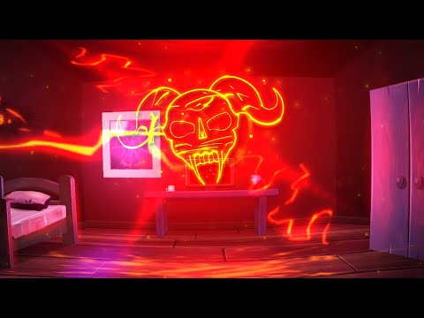
I am not a fan on how a lot of the level is just Slaughterhouse, and they dont do anything original except make the straight-fly longer. The ONE click sound effect the part uses gets quite annoying really quick. I also dont get why the player just dies when they are in the middle of the hell art, it doesnt make any sense. Then, the level just rehashes the “breaking the 4th wall” effect with the realistic part coming in. It just feels like the creator, IMOXII, said, “Ooo, rage quit did that screen effect, I should do that too!!!” But, atleast with rage quit, it overall looks good, but with this level, it DOESNT!! As I said, the backgrounds look nice, but everything else doesnt. The arm in the part looks really bad and has that uncanny-valley feeling. Also, when the person “picks up” the mug, its just floating and feels like the creator didnt have enough time or got lazy and didnt make the arm. Also, here is when the worst part comes in, it is TERRIBLE. The hell art comes out of the screen, with the “breaking screen” effect that we have seen many times in other levels, and then IMOXII tried to remake the hell art. It is SO BAD, that I actually LAUGHED when I first saw it, it looks like GARBAGE. Nothing else really happens, but the lighting does look really nice, so i’ll give the level that. He just throws stuff at you, you dodge it, nothing there is remarkable, good or bad. Finally, you go into this portal and the level ends. It feels like the creator ran out of time and just made that part in like, 20 minutes because it looks really basic compared to everything else.
Overall, this level is quite bad, but its not remarkably bad, well, mostly. It is remarkably unoriginal and rehashes things we've seen in other levels before while trying to come off as impressive. 4/10, atleast the levels auto.
extremely funny. also total garbage
This level is… alright. It’s a pretty basic story line, and doesn’t really do anything unique. The only impressive visuals ironically comes from the copied slaughterhouse, with the realism instead looking creepy and uncanny valley like.
Overall, there’s just not much special from this level, and half of it is just copied slaughterhouse.
(Points will be deducted for unoriginality)
I'm a Rage Quit defender. As much as it can be generic, there is some fun and cool stuff about it. This level does not hold any of the positives of Rage Quit despite being very obviously inspired.
This is exactly the problem with levels made for money on a deadline, it is just sloppy.
I don't think the creator should be burned at a stake for anything like this I get why you would make this for a competition and all power to them, but it is just incredibly unpolished in execution that really disappoints me and I hope IMOXI has the vision to improve the level now that the level was entered to the competition and can just be updated.
In specifics for what I think could be polished:
Make the invisible objects Slaughterhouse used - actually invisible. I have no idea why they were left visible despite being an incredibly easy change.
Some objects overlap in the slaughterhouse section incorrectly, and it looks bad.
Make the click sounds more varied and not just the same one.
Include a missing click sound just before the player dies, it feels strange to be missing.
Improve the hand art or just honestly remove it, it takes away from a lot of the level.
Fix the clipped lighting on the desk light in the room - also probably fix the other T3 glow artefacts at the desk scene.
Put the wardrobe in the room closer to the wall, nobody has it that far from the wall.
Improve "endscreen" or just remove it.
Again, fair game to make this level for a competition, but there is kind of no excuse to leave it this unpolished after the fact.
it happened again. its auto at least so i can turn off my monitor for this one
also please for the love of god use multiple click sounds instead of just one
There's another one????
Info
Videos

Replays
SubmitGDPR Cookie Consent
Hyperbolus uses cookies and local browser storage to enable basic functionality of the site. If we make any changes to these options we will ask for your consent again.
sorry about this gang
